The Seed
Branding Project
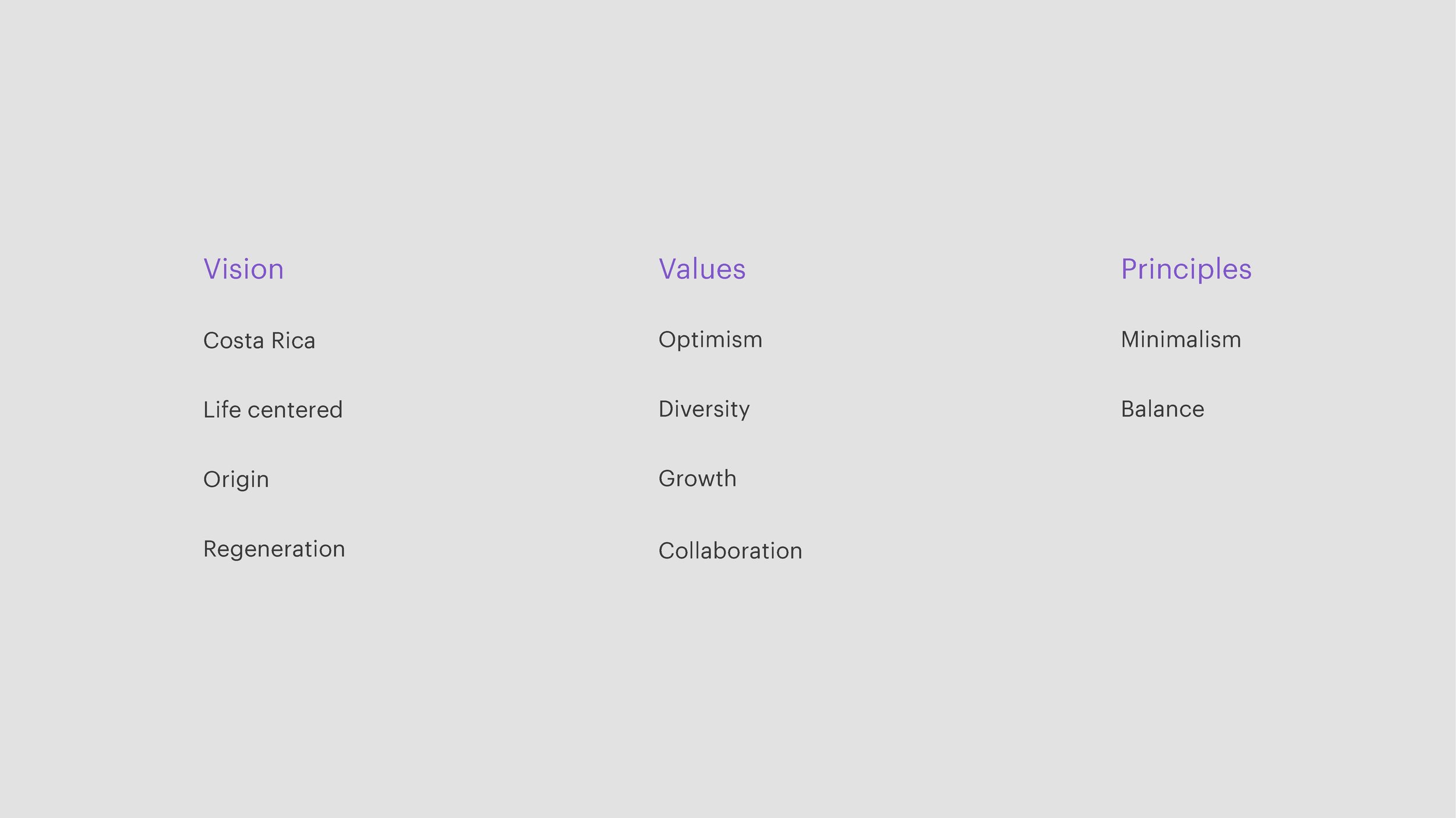
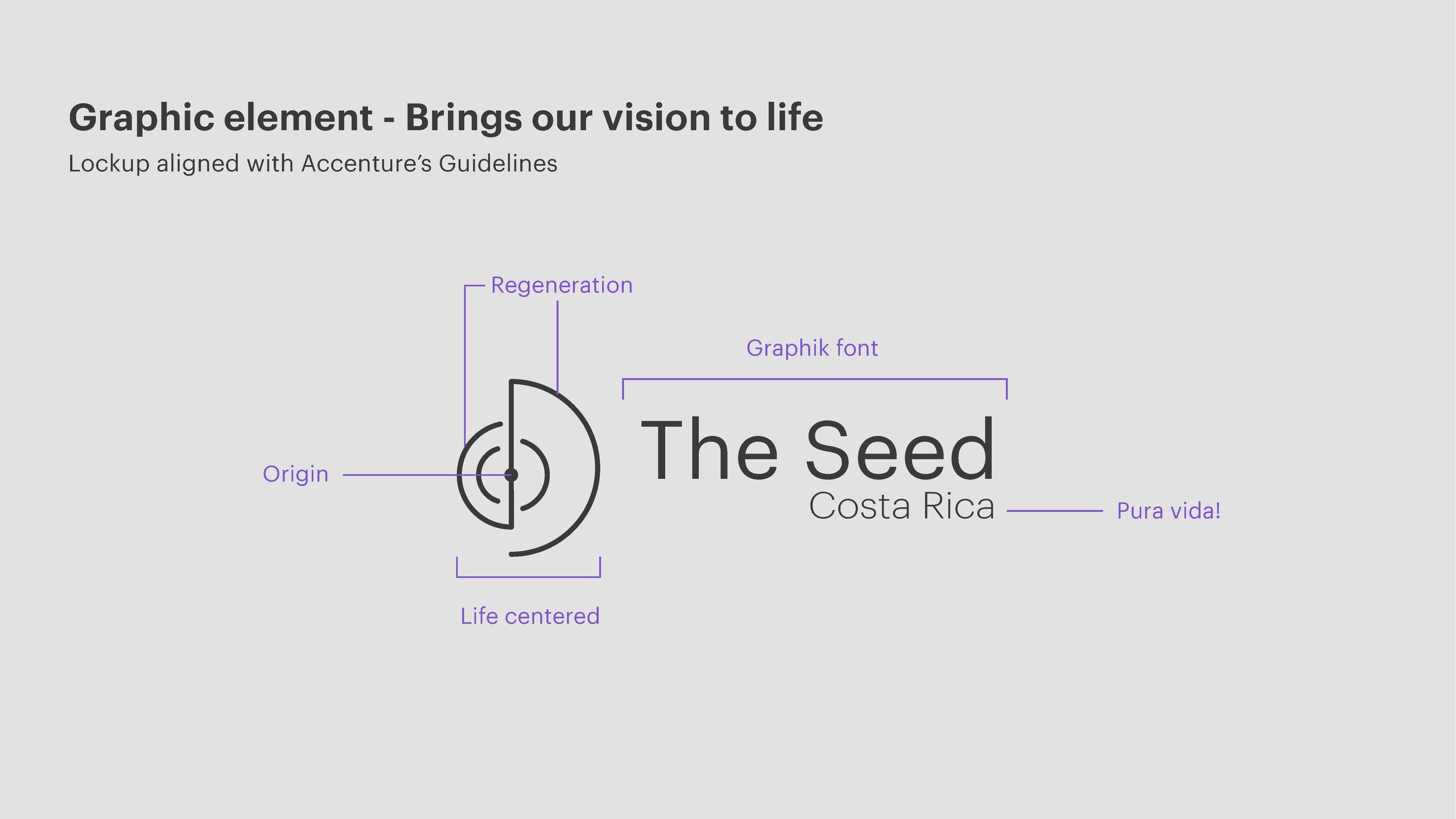
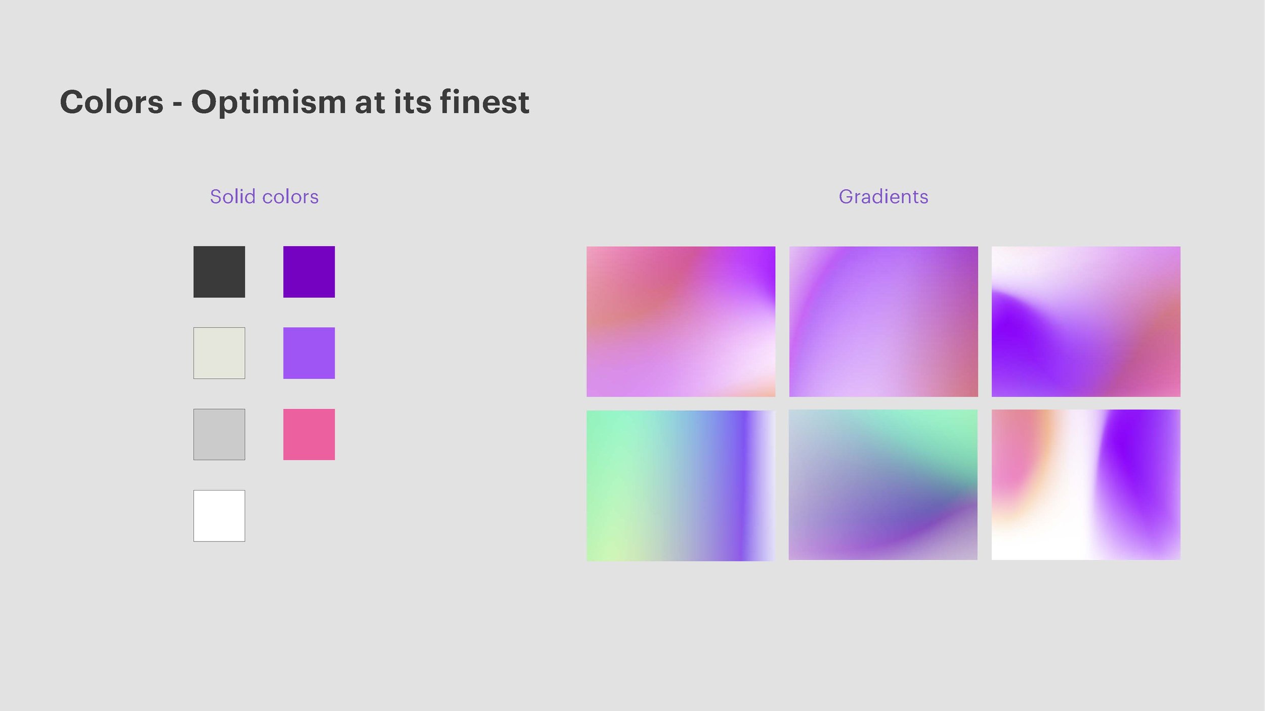
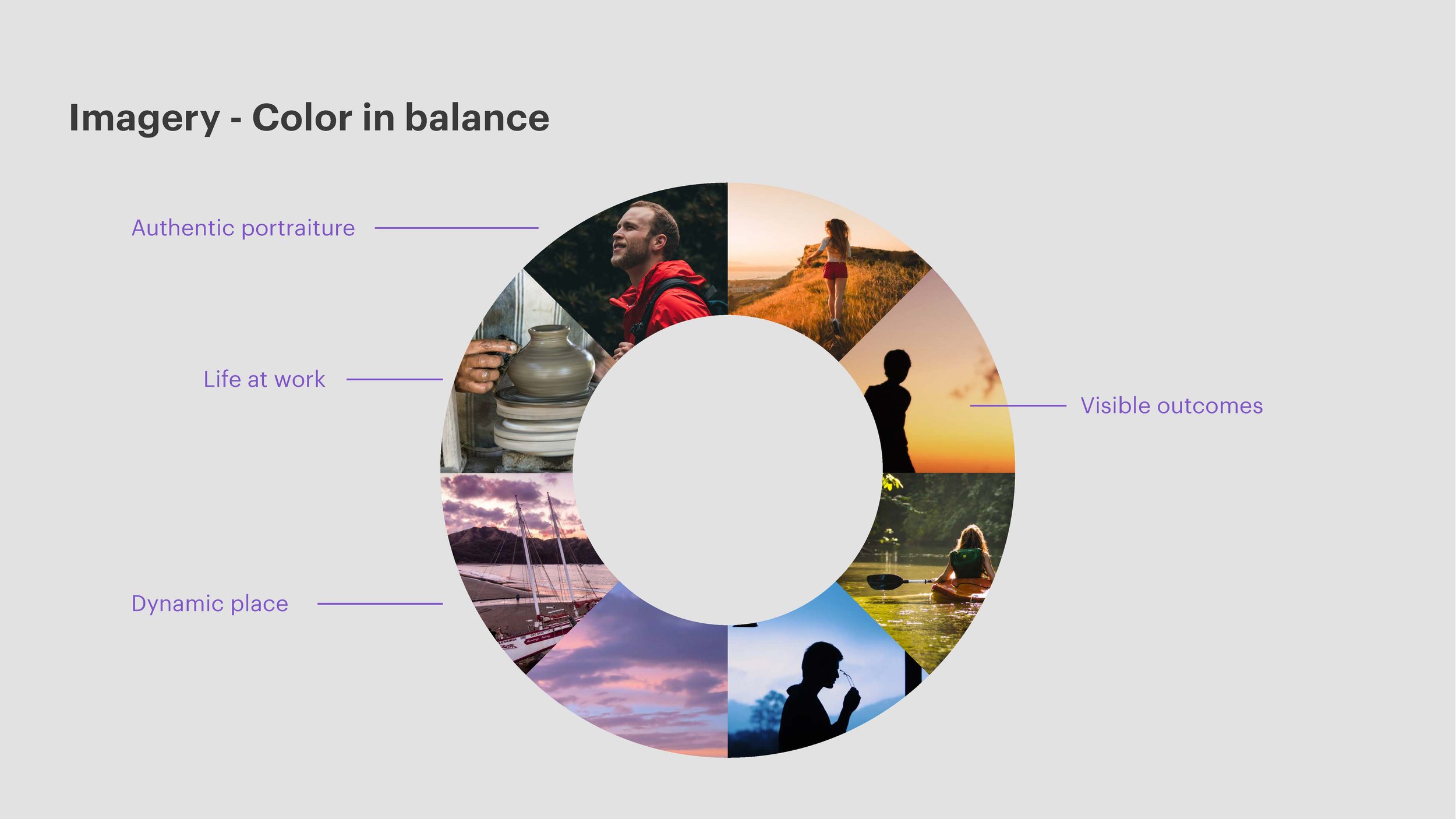
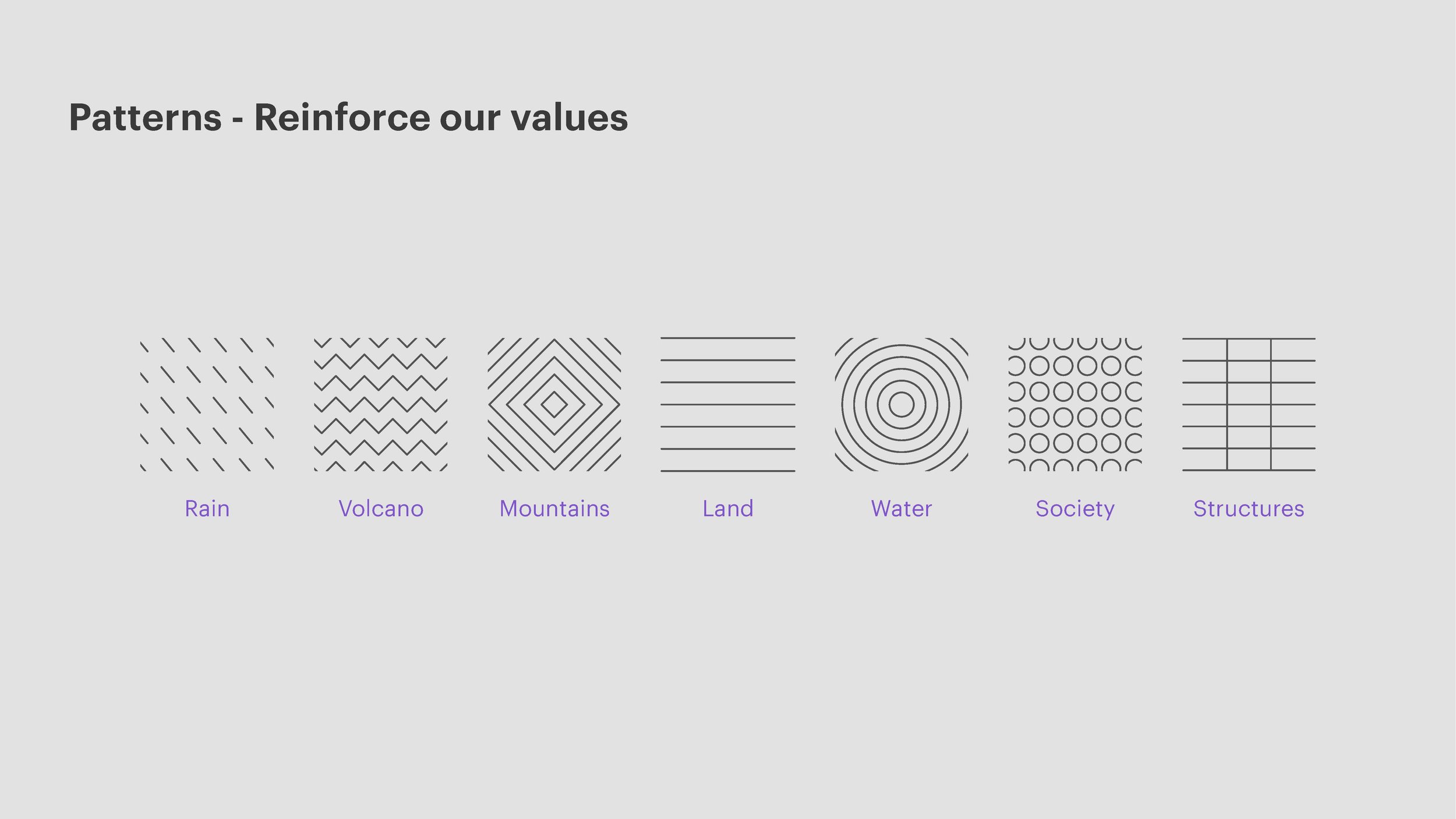
This project has been one of the most difficult I have worked on. One of the main reasons of that is that I had to create a new branding, based on another branding, since “The Seed“ belonged to Accenture. As you’ll see below, I divided all the key words that the team gave me in three different groups: vision, values and principles. This method really helped me to focus on the key words that were going to help me to develop the brand visually, and others that could be represented by other communication elements, copy writing as an example.
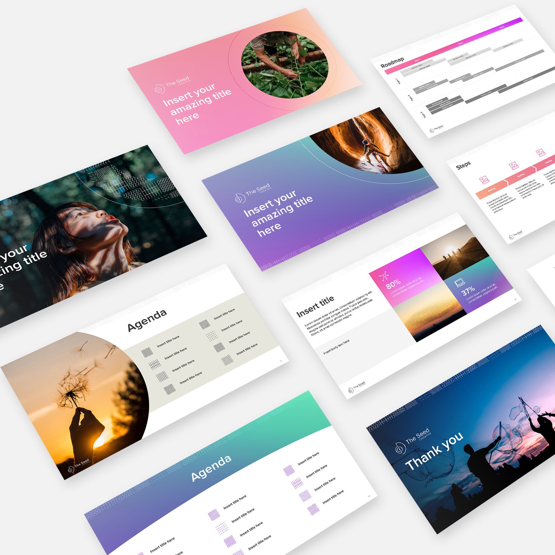
This team wanted its own logo and then the creation of other materials: power point template and a newsletter.

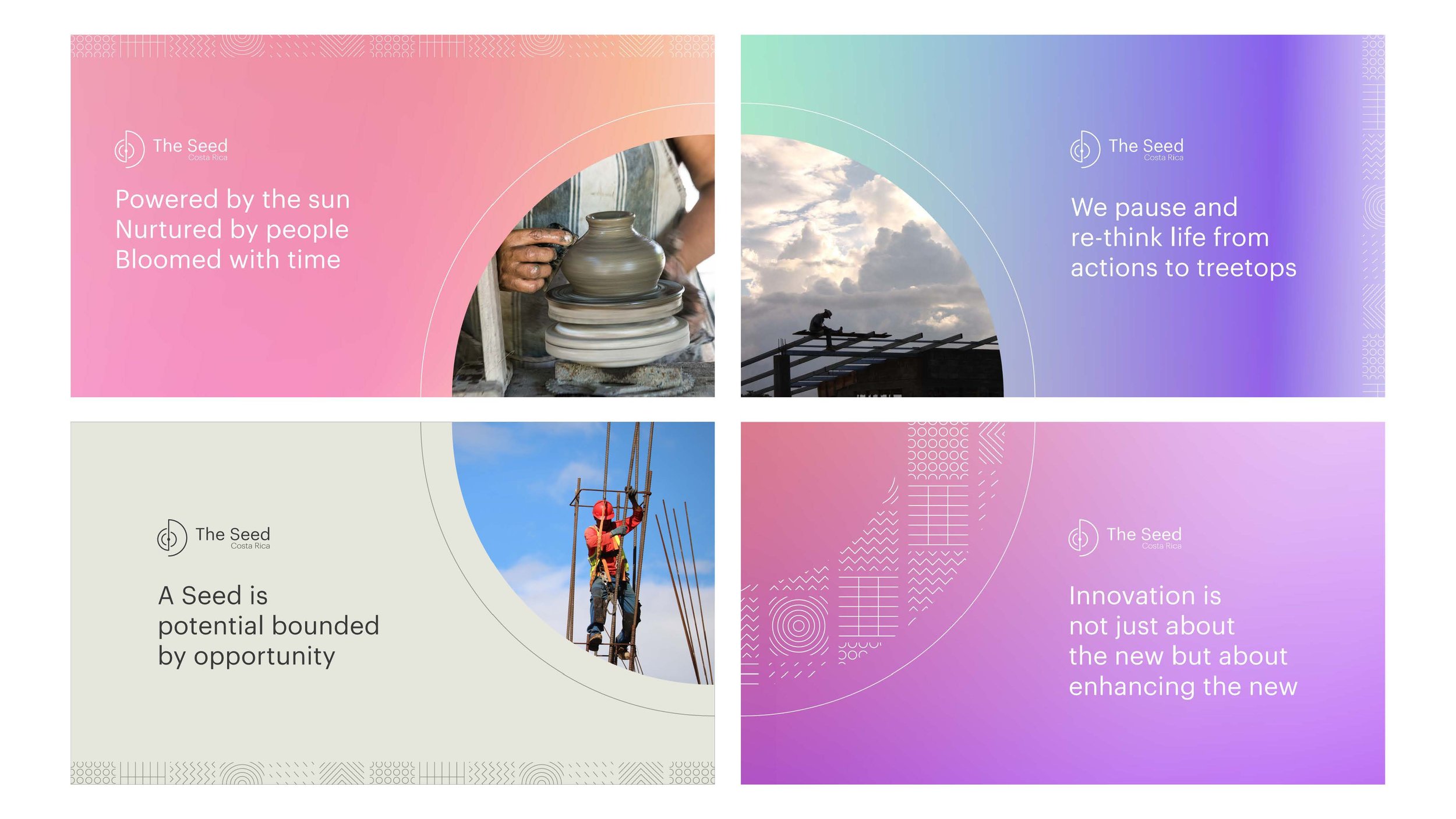
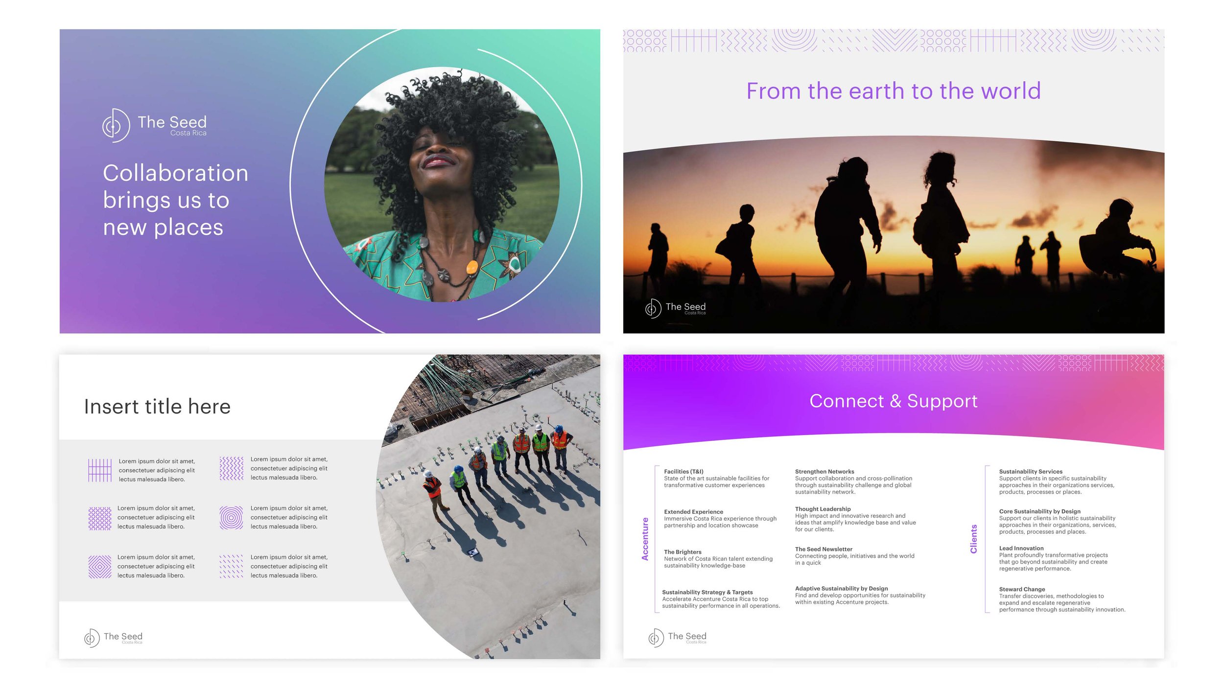
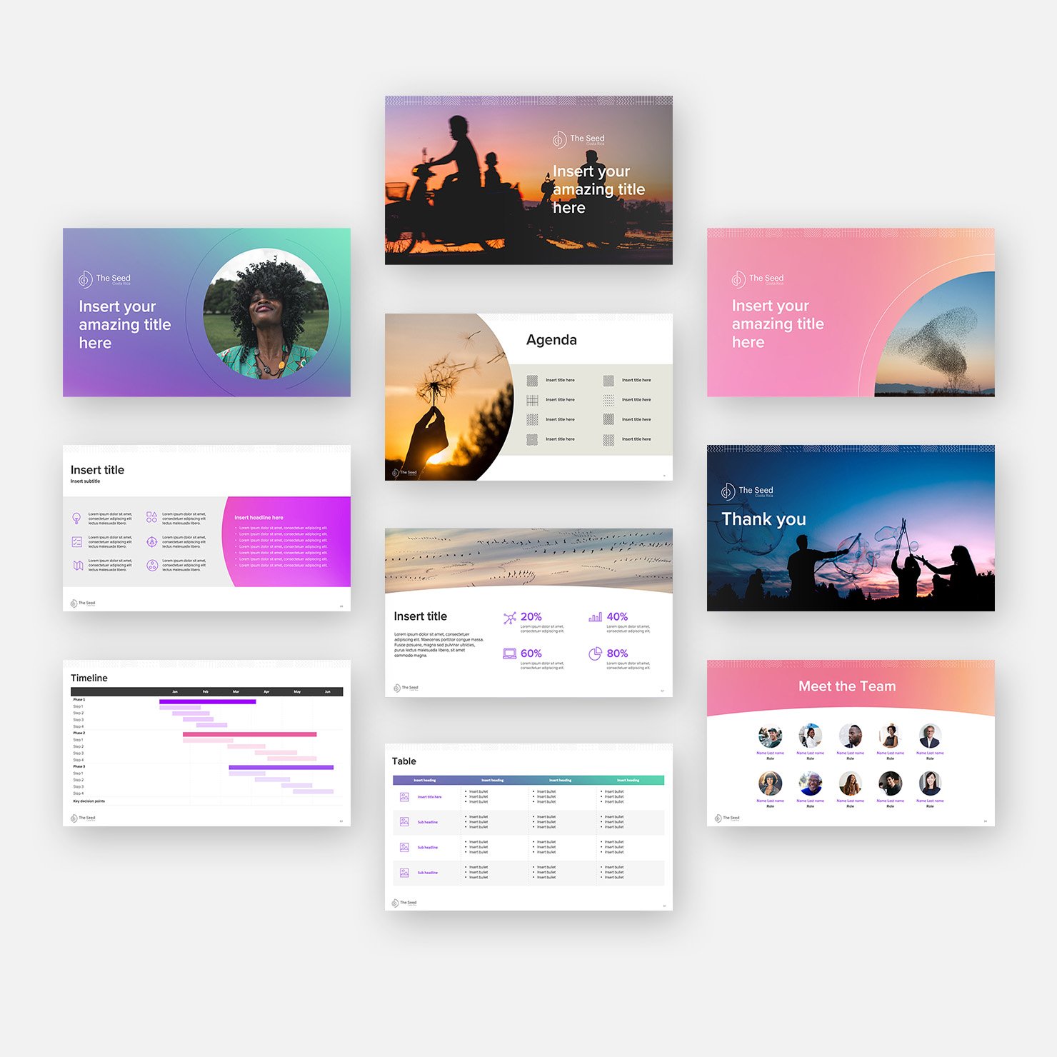
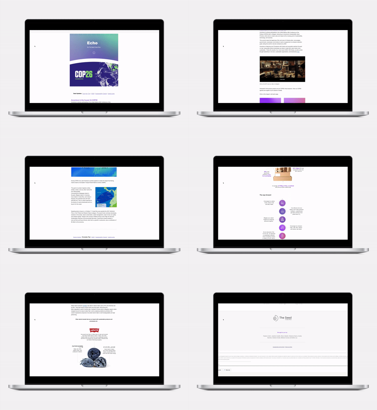
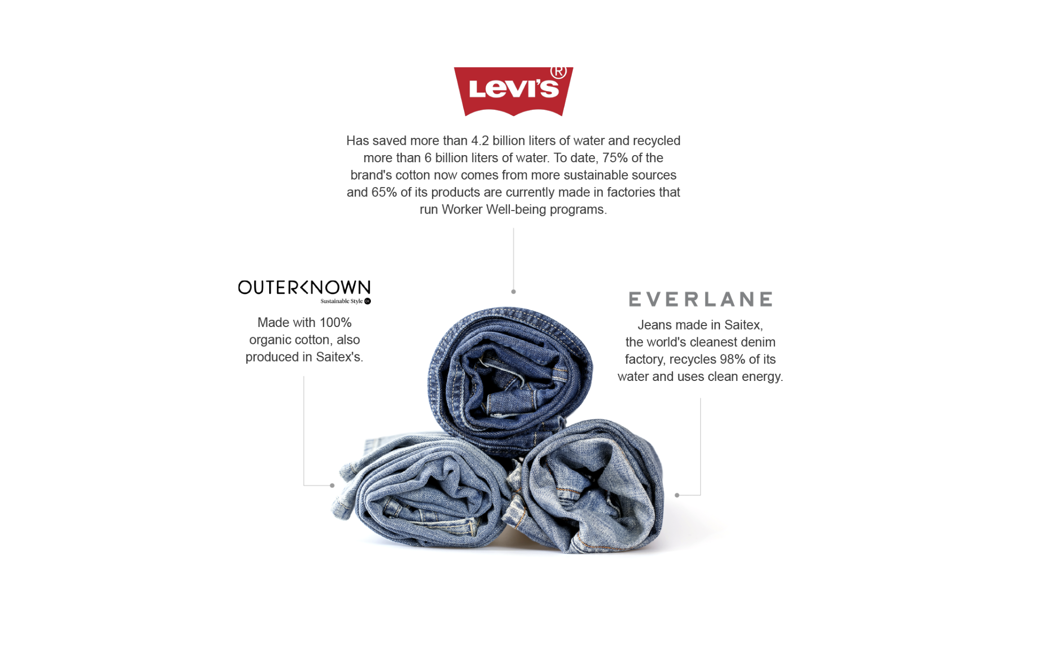
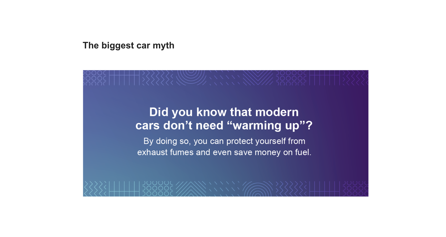
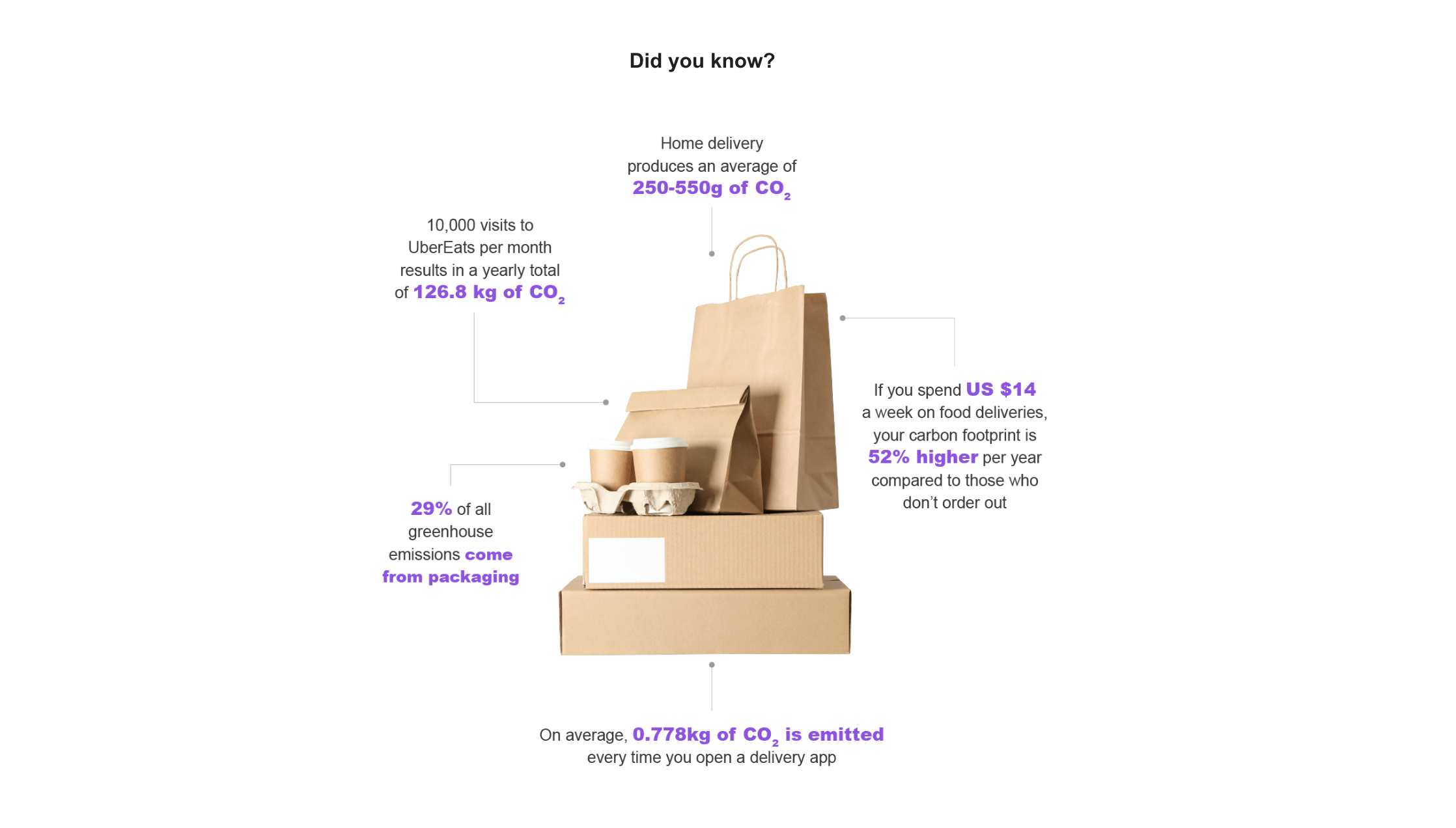
A newsletter was developed as well, based on this branding. Another important point to mention is that they wanted something different and interactive, that’s why GIFs and animations were included in it.
